Unlock the Recipe for Menu Magic: 5 User-Experience Secrets to Boost Restaurant Orders
Average Reading Time: 7 minutes
Table of Contents
- Hungry for Conversions? Craft Irresistible Digital Restaurant Menu Content & Information (That Sells!)
- Introduction: Unlocking the Recipe for Menu Magic
- Chapter 1: Know Your Diners - The Secret Ingredient
- Chapter 2: Crafting Mouthwatering Descriptions - Words that Sizzle & Sell
- Chapter 3: Mobile-First Feast - Serving Delight on Every Screen
- Chapter 4: Accessibility for All - Sharing the Flavor with Everyone
- Chapter 5: Visual Symphony - Design a Menu that Tantalizes
- Chapter 6: Navigation Nirvana - Guiding Guests to Ordering Bliss
- Conclusion: Bon Appétit to Higher Profits - The Final Course of UX Goodness
Hungry for Conversions? Craft Irresistible Digital Restaurant Menu Content & Information (That Sells!)
Imagine diners raving about your menu's witty descriptions, ordering with smiles, and coming back for more. Forget confusing layouts and bland descriptions! This guide unlocks the recipe for crafting irresistible digital restaurant menu content & information that converts guests into loyal customers.
Introduction: Unlocking the Recipe for Menu Magic
Digital restaurant menu content & information is the secret sauce that can transform your online menu from a static page to a powerful conversion tool. By understanding your diners, writing mouthwatering descriptions, and designing a user-friendly experience, you can turn every click into a delicious order.
Ready to whip up a menu masterpiece? Get ready to dive into the essential ingredients:
Chapter 1: Know Your Diners - The Secret Ingredient
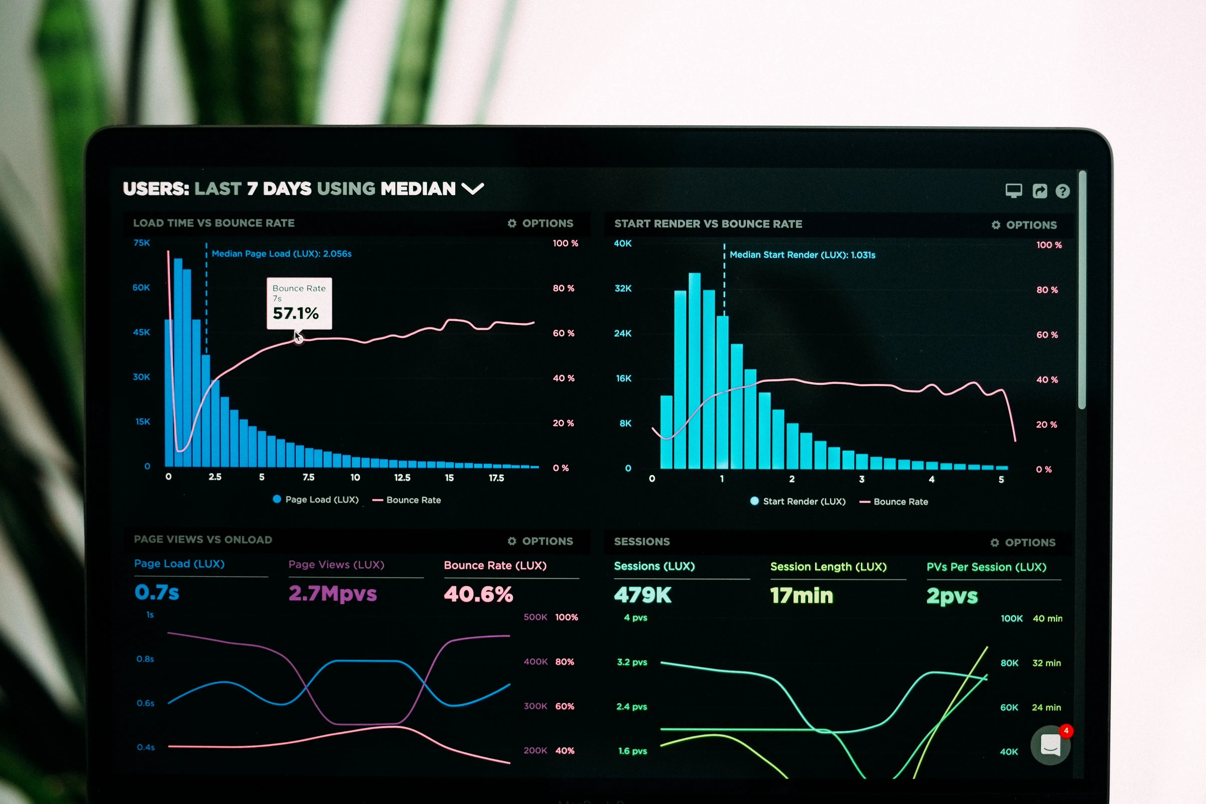
Every great dish starts with understanding the palate it's for. Just like that, crafting the perfect menu begins with knowing your diners - their needs, preferences, and even pet peeves! Use surveys, online reviews, and heatmaps to uncover their desires. Create user personas – fictional profiles representing key customer segments – to guide your content and information decisions. Remember, a menu tailored to your diners' hearts speaks volumes louder than generic descriptions.
Chapter 2: Crafting Mouthwatering Descriptions - Words that Sizzle & Sell
Think of your menu descriptions as miniature love letters to your dishes. Highlight key ingredients, cooking methods, and flavor profiles. Use evocative language that whets appetites and sparks culinary curiosity. Tell a story with your words, painting a picture of the dish and its potential to tantalize taste buds. Remember, brevity is your friend; keep descriptions concise and impactful.
Dive deeper by segmenting your audience based on dining behavior, age groups, dietary preferences, and visit frequency. Are your regulars young professionals grabbing a quick bite, or families seeking a relaxed weekend dinner? Understanding these distinctions allows you to fine-tune not only your menu items but also the way they're presented—like offering shareable plates for groups or highlighting fast, healthy options for busy lunch-goers.
Beyond preferences, don’t underestimate emotional triggers. Diners often seek comfort, nostalgia, adventure, or wellness from their meals. Use evocative language and thoughtful design to cater to these emotional drivers. For example, comfort-seeking diners may be drawn to hearty descriptions like “homestyle” or “slow-cooked,” while health-conscious guests respond to words like “fresh,” “organic,” or “nutrient-rich.” The more aligned your menu is with the mindset of your audience, the more irresistible it becomes.
Chapter 3: Mobile-First Feast - Serving Delight on Every Screen
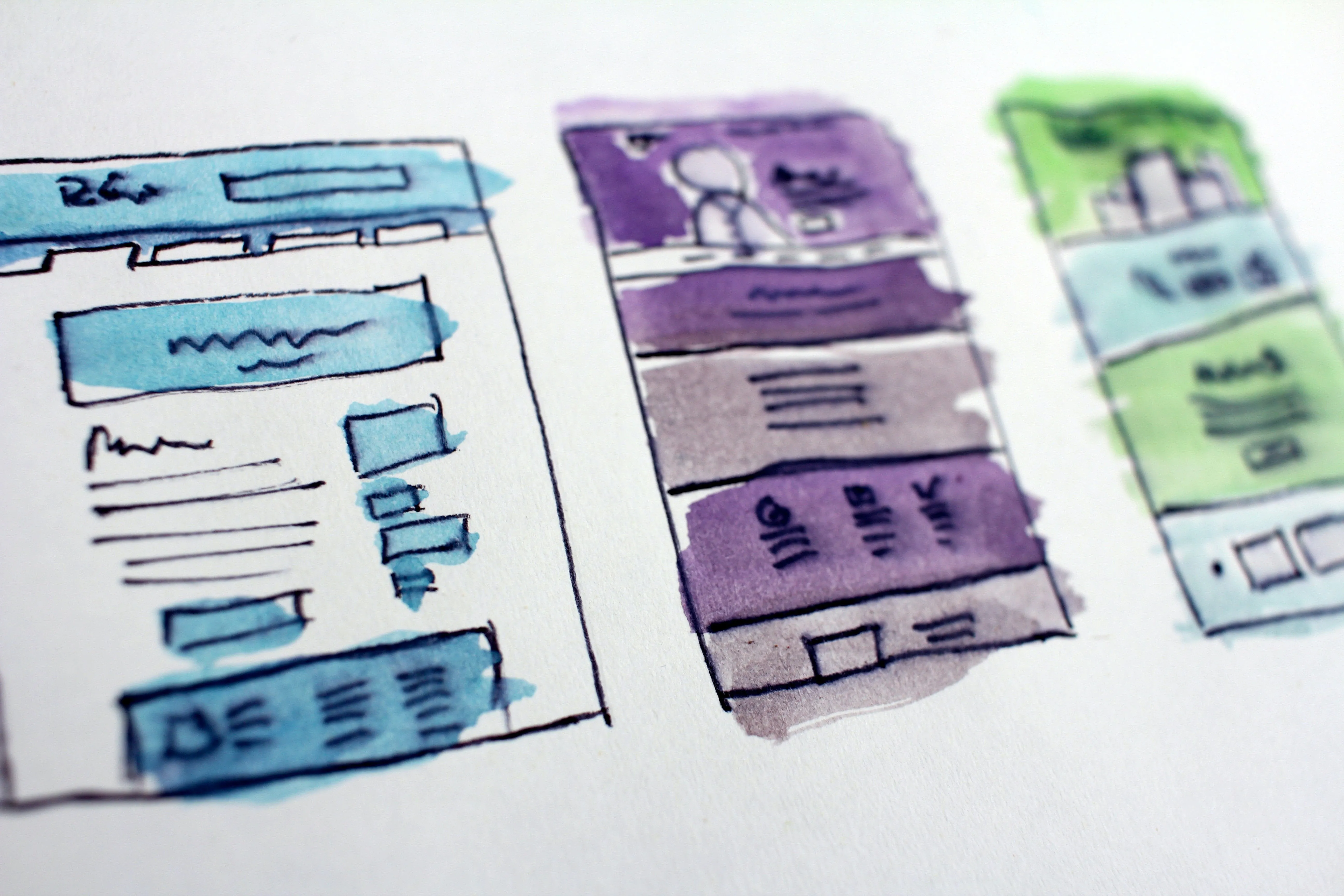
Remember, phones are the new dinner plates! Optimize your menu for smaller screens and touch interactions. Prioritize large, tappable buttons, readable fonts on high-contrast backgrounds, and lightning-fast loading times. Every tap, swipe, and scroll should be smooth and intuitive. Think thumb-friendly layouts, vertically focused content, and generous white space to avoid accidental clicks.
Don’t just stop at functionality—make your mobile menu a visual treat. Incorporate high-quality images that load quickly and adapt to different screen sizes without distortion. Use engaging icons and concise descriptions to enhance clarity and visual appeal. A well-designed mobile experience doesn’t just replicate your desktop site; it reimagines it to suit the fast-paced, on-the-go habits of today’s diners.
Additionally, consider integrating features like click-to-call buttons, one-tap reservation links, or mobile ordering and payment options. These enhancements streamline the user journey and increase conversion rates. By offering convenience and speed without sacrificing design, your mobile menu can become a powerful tool that turns casual browsers into loyal customers with just a few taps.
Chapter 4: Accessibility for All - Sharing the Flavor with Everyone
Everyone deserves to enjoy a delicious and user-friendly dining experience. Embrace accessibility best practices to make your menus inclusive for diners with visual impairments, cognitive differences, or motor limitations. Use descriptive alt text for images, logical and keyboard-friendly menu structure, and voice ordering compatibility. Remember, inclusivity isn't just good ethics; it's good business, expanding your customer base and fostering a welcoming atmosphere.
Color contrast also plays a crucial role in accessibility. Avoid relying solely on color to convey information—pair it with icons or labels to ensure clarity for colorblind users. Choose fonts that are clean, simple, and easy to read at various sizes, and ensure that background and text combinations offer sufficient contrast. These small design decisions can significantly improve usability for all guests.
Moreover, consider implementing screen reader-friendly layouts and ensuring your digital menus follow WCAG (Web Content Accessibility Guidelines) standards. Offering downloadable menus in multiple formats (e.g., PDF, plain text) can also accommodate different needs. When you design with inclusivity in mind, you send a powerful message: everyone is welcome at your table, no exceptions.
Chapter 5: Visual Symphony - Design a Menu that Tantalizes
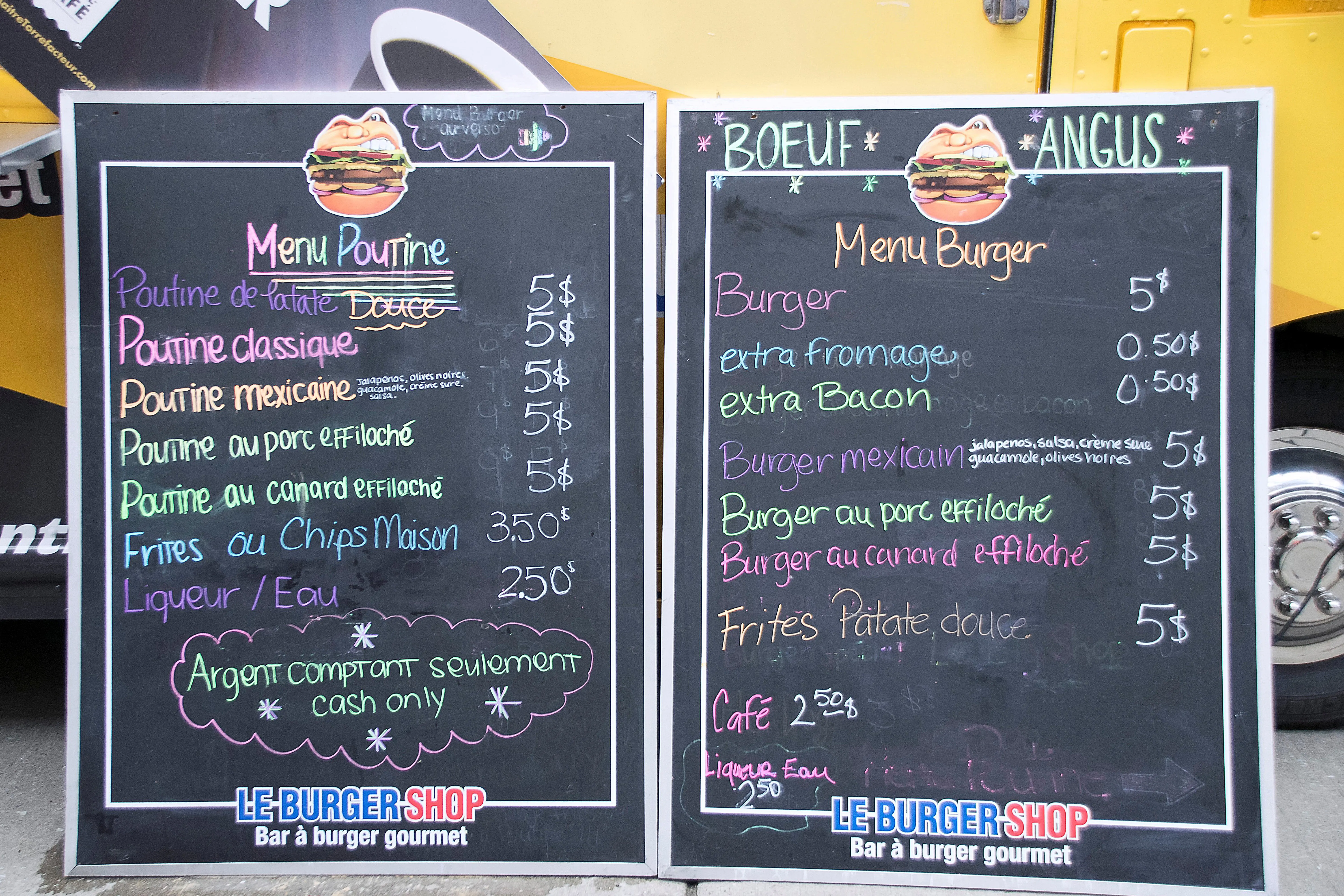
Your menu is a visual feast before the real one arrives! Use eye-catching layouts, pleasing color palettes, and captivating imagery to draw diners in and guide them through their culinary journey. Think of it as an artistic canvas, with every element carefully chosen to evoke desire and whet appetites.
Strategic use of typography can further elevate your menu’s impact. Combine no more than two to three complementary fonts to create hierarchy—use bold, larger fonts for section titles and clean, legible ones for dish descriptions. Align text consistently and allow for adequate spacing between items to avoid overwhelming the reader. The goal is a clean, inviting layout that naturally guides the eyes from starters to desserts.
Don’t underestimate the power of visual cues like icons, borders, or subtle background textures. These elements help organize information intuitively and add personality to your menu. When harmonized effectively, your visuals not only spark appetite but also reinforce your brand’s identity—turning your menu into a memorable and mouthwatering part of the dining experience.
Chapter 6: Navigation Nirvana - Guiding Guests to Ordering Bliss
Keep your menus simple and organized, with logical categories and intuitive search options. Think cascading menus for subcategories, helpful filters for dietary needs, and progress indicators for ongoing orders. Avoid hidden links and confusing page layouts; remember, diners shouldn't need a map to navigate your menu.
Consider adding a “favorites” or “recently viewed” section to help diners quickly find their go-to dishes. This feature enhances the user experience by reducing the time spent searching and improving order accuracy. For repeat customers, personalization can be a game-changer, making their dining experience feel more tailored and special.
Additionally, ensure that your menu is responsive across devices. Whether diners are browsing from their phones, tablets, or desktops, the layout and navigation should adapt seamlessly to different screen sizes. A fluid, device-agnostic design ensures that customers can explore your offerings effortlessly, no matter where or how they’re ordering.
Conclusion: Bon Appétit to Higher Profits - The Final Course of UX Goodness
By embracing UX best practices, you transform your digital menu from a static page to a powerful conversion tool. You've learned to know your diners, prioritize mobile-first design, embrace accessibility, create visual harmony, and guide them through intuitive navigation. Your descriptions now sing with flavor, leaving diners eager to order. Remember, UX is a journey, not a destination. Continuously test, iterate, and improve your menu based on user feedback. By keeping your guests at the heart of every design decision, you'll watch your orders flow, profits rise, and brand reputation soar. So, fire up your digital oven, embrace the UX magic, and watch your restaurant thrive!
Share your UX success stories, ask questions, and join the conversation! Comment below, share this article with your fellow restaurateurs, and let's work together to create digital menus that tantalize both taste buds and user experience. Remember, in the world of online dining, the most delicious experiences are those that are both mouthwatering and effortless. Bon appétit!
For more information on Eatery101.CC, you can check out the following URL:
- Website: https://eatery101.cc
- Blog: https://blog.eatery101.cc
P.S. Don't forget to follow us on social media, the community, the website and the - - YouTube channel for even more inspiration and updates!
- Website: https://thereviewshed.cc
- Website: https://van-santen-enterprises.com
- Community: https://community.van-santen-enterprises.com
- Marketing Courses: https://thetraininghub.cc
- The Store: https://van-santen-enterprises.cc
- YouTube Channel: @VanSantenEnterprises
To Learn more about "Digital Marketing" or to stay informed, subscribe to the free newsletter or community.
DigitalRestaurantMenuContent #DigitalRestaurantMenuInformation #RestaurantMenuUX #UserExperienceBestPractices #DigitalMenu #Accessibility #Mobile-firstRestaurantMenu#RestaurantMenuOptimization #OnlineMenuDesign #UserPersonaForRestaurantMenu#RestaurantMenuA/BTesting #VoiceOrderingRestaurantMenu #RestaurantMenuConversionRate #AccessibleRestaurantMenuGuidelines #VisualDesignForRestaurantMenus #RestaurantMenuNavigation #RestaurantMenuContentWriting #CallToActionInRestaurantMenuS #RestaurantMenuPerformanceOptimization #UserFeedbackForRestaurantMenus
TL;DR: Forget bland descriptions and confusing layouts! This guide reveals the secrets to crafting digital restaurant menus that captivate diners, boost orders, and drive loyalty. Discover UX best practices for mouthwatering descriptions, mobile-first design, accessibility, visual appeal, and seamless navigation. Get ready to transform your menu into a conversion powerhouse!


