Create Menus That Tantalize Taste Buds & Boost Profits: The Ultimate Guide to Digital Menu User-Experience!
Average Reading Time: 5 minutes
Table of Contents
- Hungry for Conversions? Craft User-Friendly Digital Menus & Watch Orders Flow (Like Wine!)
- Introduction: Sizzle Up Your Sales with UX Savvy
- Chapter 1: Knowing Your Diners - The Secret Ingredient
- Chapter 2: Mobile-First Feast - Serving Delight on Every Screen
- Chapter 3: Accessibility for All - Sharing the Flavor with Everyone
- Chapter 4: Visual Harmony - Designing a Menu that Tantalizes
- Chapter 5: Navigation Nirvana - Guiding Guests to Ordering Bliss
- Chapter 6: Content that Craves Engagement - Writing Descriptions that Dazzle
- Conclusion: Bon Appétit to Higher Profits - The Final Course of UX Goodness
Hungry for Conversions? Craft User-Friendly Digital Menus & Watch Orders Flow (Like Wine!)
Imagine diners raving about your user-friendly menu, placing orders with a smile, and returning for more. This isn't a fantasy; it's the magic of User Experience (UX) applied to your digital menus. But with endless tech and design choices, where do you start? Fear not, restaurateurs! This guide unveils the secret ingredients for crafting menus that convert guests into loyal customers.
Introduction: Sizzle Up Your Sales with UX Savvy
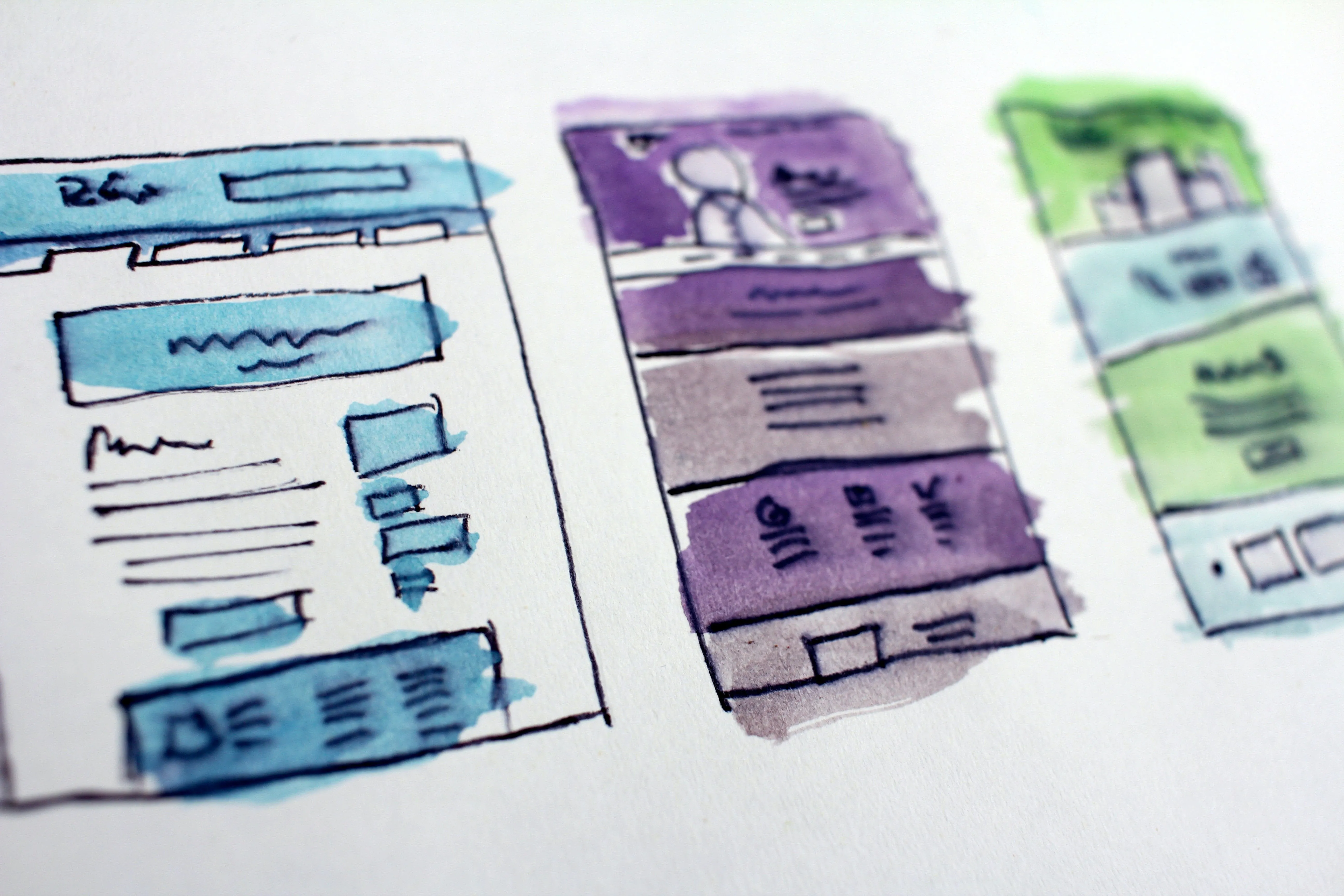
Digital menus are your frontline for wooing diners and boosting orders. Yet, so many menus fall flat, leaving guests frustrated and fumbling. Forget the technical headaches and usability nightmares! By embracing UX best practices, you can transform your digital menu into a conversion machine. Think clear navigation, mouthwatering descriptions, and seamless ordering – all wrapped in a visually stunning package. The result? Happy diners, increased profits, and a brand reputation that sings with delight.
Chapter 1: Knowing Your Diners - The Secret Ingredient
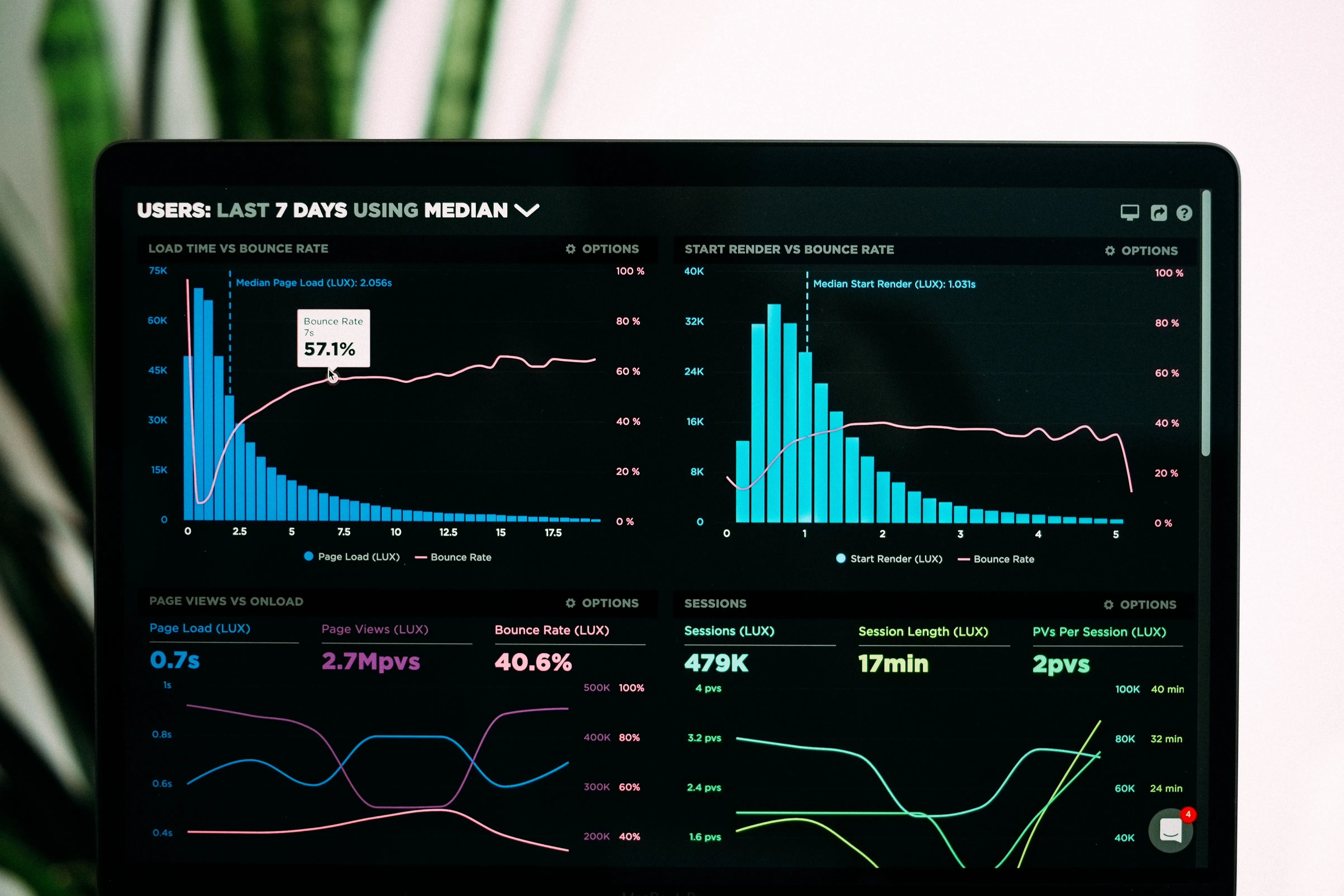
Before you whip up a UX masterpiece, get to know your diners! Use surveys, online reviews, and heatmaps to understand their needs, preferences, and pain points. Do they struggle with tiny fonts? Are hidden links driving them mad? Create user personas based on your research, imagining real people with specific desires and frustrations. This empathy-fueled approach is your secret weapon for crafting menus that resonate.
Chapter 2: Mobile-First Feast - Serving Delight on Every Screen
Remember, phones are the new dinner plates! Optimize your menu for smaller screens and touch interactions. Prioritize clear buttons, readable fonts on high-contrast backgrounds, and lightning-fast loading times. Every tap, swipe, and scroll should be smooth and intuitive. Think thumb-friendly layouts, vertically focused content, and generous white space to avoid accidental clicks.
Chapter 3: Accessibility for All - Sharing the Flavor with Everyone
Everyone deserves to enjoy a delicious and user-friendly dining experience. Embrace accessibility best practices to make your menus inclusive for diners with visual impairments, cognitive differences, or motor limitations. Use descriptive alt text for images, logical and keyboard-friendly menu structure, and voice ordering compatibility. Remember, inclusivity isn't just good ethics; it's good business, expanding your customer base and fostering a welcoming atmosphere.
Chapter 4: Visual Harmony - Designing a Menu that Tantalizes
Your menu is a visual feast before the real one arrives! Use eye-catching layouts, pleasing color palettes, and captivating imagery to draw diners in and guide them through their culinary journey. Think of it as an artistic canvas, with every element carefully chosen to evoke desire and whet appetites.
The Power of Design:
- First Impressions Matter: The initial visual impact of your menu sets the tone for the entire dining experience. A cluttered, poorly designed menu can instantly turn diners off, while a visually harmonious one creates a sense of excitement and anticipation.
- Color Psychology: Use color strategically to influence diners' emotions and choices. Warm colors like reds and oranges stimulate appetite, while cooler blues and greens evoke feelings of freshness and calmness. Experiment with color palettes that complement your brand identity and the overall ambiance of your restaurant.
- Whitespace is Your Friend: Don't overcrowd your menu! Ample white space between sections, text, and images improves readability and prevents your design from feeling overwhelming.
- Typography that Tells a Story: Choose fonts that are easy to read on both desktop and mobile screens, while aligning with your restaurant's personality. Bold, playful fonts might suit a casual eatery, while elegant script fonts could complement a fine dining establishment.
- High-Quality Imagery: Showcase your culinary creations with mouthwatering photos or illustrations. Use close-ups to highlight ingredient details and textures, and ensure the lighting and presentation are appetizing.
Examples in Action:
- Modern Minimalism: For a contemporary restaurant, a clean and minimalist design with monochromatic color schemes and high-contrast fonts can create a sophisticated and elegant feel.
- Rustic Charm: A rustic eatery might opt for wooden textures, warm earth tones, and hand-drawn illustrations to evoke a cozy and inviting atmosphere.
- Playful Palette: A family-friendly restaurant can embrace a vibrant color palette with playful fonts and cartoon elements to engage younger diners.
Visual Harmony in Practice:
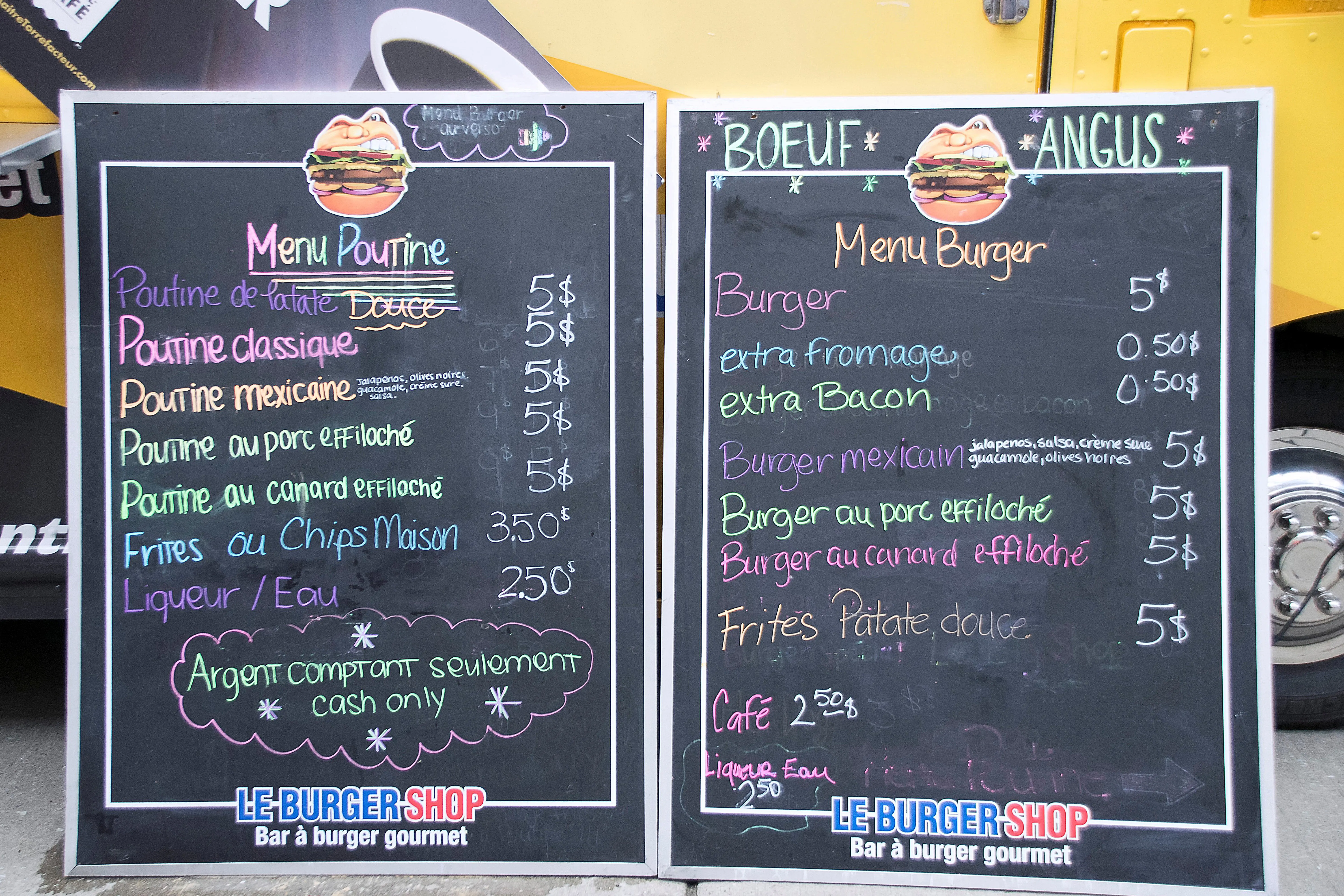
- Logical layout: Organize your menu into clear sections (starters, mains, desserts) with intuitive subcategories. Use headings, dividers, and white space to visually differentiate sections and guide diners through their choices.
- Image placement: Don't just scatter photos randomly. Place them strategically to highlight specific dishes, draw attention to special offers, or enhance the overall aesthetic.
- Mobile-friendly design: Ensure your menu adapts seamlessly to smaller screens, with large tappable buttons, legible fonts, and image scaling that prevents pixelation.
Remember: Your menu is an extension of your brand and a powerful tool for influencing diners' choices. By crafting a visually stunning and user-friendly menu that speaks to your restaurant's unique personality, you can create a truly memorable dining experience and elevate your business to the next level.
Chapter 5: Navigation Nirvana - Guiding Guests to Ordering Bliss
Keep your menus simple and organized, with logical categories and intuitive search options. Think cascading menus for subcategories, helpful filters for dietary needs, and progress indicators for ongoing orders. Avoid hidden links and confusing page layouts; remember, diners shouldn't need a map to navigate your menu.
Chapter 6: Content that Craves Engagement - Writing Descriptions that Dazzle
Think of your menu descriptions as miniature love letters to your dishes. Highlight key ingredients, cooking methods, and flavor profiles. Use evocative language that whets appetites and sparks culinary curiosity. Tell a story with your words, painting a picture of the dish and its potential to tantalize taste buds. Remember, brevity is your friend; keep descriptions concise and impactful.
Conclusion: Bon Appétit to Higher Profits - The Final Course of UX Goodness
By embracing UX best practices, you transform your digital menu from a static page to a powerful conversion tool. You've learned to know your diners, prioritize mobile-first design, embrace accessibility, create visual harmony, and guide them through intuitive navigation. Your descriptions now sing with flavor, leaving diners eager to order. Remember, UX is a journey, not a destination. Continuously test, iterate, and improve your menu based on user feedback. By keeping your guests at the heart of every design decision, you'll watch your orders flow, profits rise, and brand reputation soar. So, fire up your digital oven, embrace the UX magic, and watch your restaurant thrive!
Share your UX success stories, ask questions, and join the conversation! Comment below, share this article with your fellow restaurateurs, and let's work together to create digital menus that tantalize both taste buds and user experience. Remember, in the world of online dining, the most delicious experiences are those that are both mouthwatering and effortless. Bon appétit!
For more information on Eatery101.CC, you can check out the following URL:
- Website: https://eatery101.cc
- Blog: https://blog.eatery101.cc
P.S. Don't forget to follow us on social media, the community, the website and the - - YouTube channel for even more inspiration and updates!
- Website: https://thereviewshed.cc
- Website: https://van-santen-enterprises.com
- Community: https://community.van-santen-enterprises.com
- Marketing Courses: https://thetraininghub.cc
- The Store: https://van-santen-enterprises.cc
- YouTube Channel: @VanSantenEnterprises
To Learn more about "Digital Marketing" or to stay informed, subscribe to the free newsletter or community.
SEOForRestaurants, #WebsiteDesignForRestaurants, #RestaurantMarketingTrends, #RestaurantMarketingTrends2025, #FoodPhotography, #OnlineOrdering, #OnlineMenuDesing, #RestaurantMenuNavigation, #CallToActionRestaurantMenu, #ContinuousImprovementRestaurantMenu
TL;DR: Ditch frustrating menus and boost profits! Discover UX best practices for creating digital restaurant menus that captivate diners, increase orders, and build brand loyalty. Click to unlock the secrets!


